Trends inform any designer's work. While trends should never dictate what you choose to create, they can refresh your style and keep you inspired!
As you begin preparing communications for fall ministries, try embracing seasonal elements and current trends in 2016 to make your communications feel timely and modern.
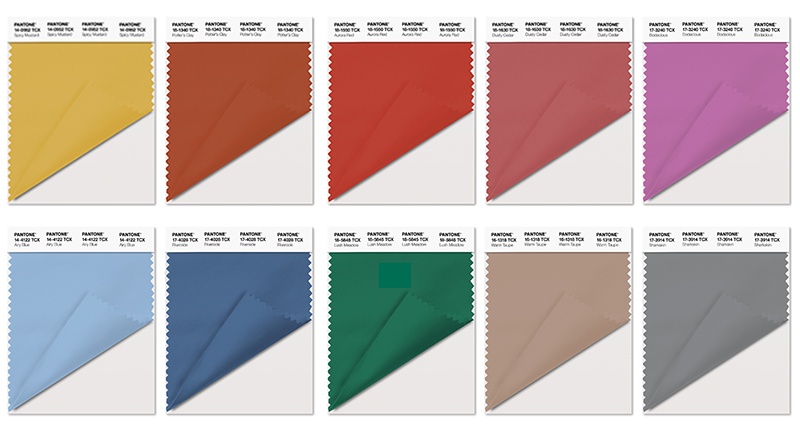
Pantone's 2016 Fall Colors
Pantone's top 10 colors this fall are drawn from fashion, but you'll see them crop up in graphic design regularly.

When choosing fall colors, think muted but rich. Draw inspiration from the season by noticing not only how leaves change, but also how earlier sunsets reveal the colors of twilight, rainy days make colors darker but richer at the same time, and evenings spent indoors cast the warm yellow light over everything. Supplement your color palettes with neutrals like cream, ivory, and soft and medium greys.
Logotypes & Dramatic Fonts
Fonts form an integral part of any design. Instead of just typing the title of your newest Bible study, or the theme Scripture verse for your Sunday School this year, get creative! Consider creating a logotype (a logo made entire of interesting text) or dramatic font choices that you can carry throughout your various communications about a particular ministry.
There are so many interesting things you can do when designing with text. You can even draw the text by hand on paper and turn it into a digital design masterpiece.
I like the simple approach taken in this typographic logo tutorial. To achieve this look, use a combination of two or three fonts or download a vector alphabet like these on Shutterstock. Find dramatic fonts on sites like Creative Bloq, Font Squirrel, or Font Space. On Google Fonts, filter the view to just handwriting fonts for more great free options. I personally loves this hand-lettered chalkboard font or Molle by Google Fonts for fall.
Next, add graphic elements like lines or rustic and vintage vector embellishments, or replace the existing text in premade badges to make them your own.
Check out these designs on Lightstock.com or the free social graphics that you get if you sign up for a subscription (can you tell I'm a Lightstock fan?). You can also find inspiration on Pinterest. I stumbled across the rustic designs of Jorgen Grotdal today; a designer in Norway, he created some amazing designs in 2015 that remain very on-trend this year.
Geometric Shapes
Geometric shapes abound in web design, fashion and more right now. In this article about geometric design by Canva.com, check out examples #15 and #16, where shapes are used to cut photos into something other than squares and rectangles. You can elevate any collage by taking this extra step!
Examples #3, #18, #23, and #35 show how simple it is to combine patterns and solid colors to easily create bold designs.
Check out freepik.com for geometric shapes and other quality (but still free) vectors like wreaths, leaves, and more.
Flat 2.0 (Material Design)
Flat 2.0, also known as material design, is the latest evolution of the flat design trend. Developed by Google, it brings light and shadow to flat design for an added sense of realism.
Flat 2.0 lets you branch out from the super minimalist strictures of flat design, incorporating long shadows, gradients, and more.
You can learn more about material design in Google's tutorials, including how to choose colors for and what icons to use in your projects.
What are your favorite design trends in 2016? Tell us about them in the comments below! Happy designing!
Interested in learning about more ways to use technology in your church? Subscribing to this blog!


