Microsoft Word gets a bad rap when it comes to design tools. When you think of designing in Word, do you see pixelated clip art and hot pink Comic Sans? Thankfully, it’s not 1999 any more!
While designing in Word can be frustrating, using this software doesn’t mean your documents need to be ugly or plain. When everyone in your church office, not to mention all of your volunteers, already have Word and know how to use it, it’s a great software solution for your group. (There’s even a free online version, which is awesome when multiple users need to work on the same document.)
Themes, styles, and—most importantly—templates can all help you maintain consistent branding without asking a designer or the communications person to clean up each and every document.
Try these six tips, and you’ll see how easy it is to improve the aesthetic appearance of Word documents.
1—Use a Template
Templates can function as a good starting point when creating a new Word document. With placeholder text and basic formatting already in place, you can modify the fonts, colors, and spacing as needed (see #3 below) without starting from scratch.
Microsoft Word Online offers a large number of templates. I particularly like the Simple Cover Letter and Meeting Notes, both of which are bold and modern. (Don’t feel restricted by the names; both of these work for more than just letters or meeting notes.) The Business Trip Checklist is also great for any checklist.
2—Use a Theme
Nine times out of ten, I go with a blank document and then choose a theme. Themes are a collection of paragraph and character styles.
Once you apply a theme, apply the paragraph and character styles within it to quickly apply fonts, sizes, colors, and spacing. You can always check to see where those styles are applied within a document using the Styles window. I’m a fan of the bright, casual themes like Pixel, Summer, or Waveform, as well as the more professional look of themes like Black Tie, Formal, or Median.
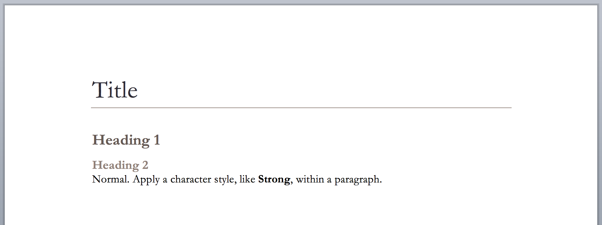
In the examples below, I’ve applied Title, Heading 1, and Normal paragraph styles, along with Strong character style. Here is the theme Pixel:
![]()
Next, here’s the same document, but with the theme Formal:

Once styles are applied, it’s easy to completely change the appearance of your document, just by switching themes!
3—Make It Your Own (Change & Create Styles)
Take themes to the next level by modifying or adding styles.
If you want to keep your modifications for future documents, save a custom theme. Unfortunately, this custom theme will only be saved on your computer. Saving your document as template (see tip #4 below) will let other users easily apply your custom theme as well.
4—Create a Template (Save As Template)
According to Microsoft, “a template is a document type that creates a copy of itself when you open it.” By saving your Word document as a template, you can keep all of the great visual improvements you just made AND let everyone else easily use the look in their future docs. Your custom templates can even be used with Word Online.
When making a template, include placeholder text to demonstrate the styles available in the document, as well as how to use them. You can label each section logically, such as the examples in tip #2. For placeholder body copy, use Lorem Ipsum text from a website like Lipsum Generator.
For a longer document, insert page breaks to ensure that odd divisions don’t happen in new documents. For instance, you wouldn’t want a new title or heading 1 styled line to fall at the very bottom of the page, only to have the body copy that follows it on the next page.
Save your template to a network drive in the office or to a cloud-based drive. Other users can then easily use your theme and styles in each new document they create. It’s a win-win!
5—Install Free Fonts
When you want to branch outside of the system fonts to elevate your design or stay on brand—or, when you’re working with a large group of volunteers who all may have different fonts installed on their computers—try using free downloadable fonts.
I like using Google Fonts (not all are downloadable, but many are), Font Squirrel, or DaFont. Keep in mind that not every free font online is available for commercial use. Some require a donation to the designer or are limited to personal use only.
Learn more about successfully combining fonts, as well as some good Google Font combinations to try, in my previous blog post.
6—Choose Your Own Colors
While Word does offer a decent variety of standard color themes, they’ve been around for a while. Update and customize the look of a theme with your own color palette. You can apply these by creating your own color theme. Or, you can further refine the design by changing the color of each style individually.
Encourage your office and volunteers to use templates that best fit your church’s brand to elevate the look of the documents and create design consistency.
Learn more about the use of technology in your church by subscribing to this blog!


