Creating a church webpage should be easy, shouldn’t it?
Whether we’re talking about a home page, an about page, or a simple blog post—type it up and hit “publish,” right? But if you want your page to actually get read, it’s not that simple.
Don’t worry, it’s not that hard, either, but it is important to know how to structure your page so that readers want to read it.
After all, the church website is one of the main ways we can communicate who we are to someone who is searching for a congregation.
And a simple blog is an incredible tool for sharing the voice of the pastor and showing what is important to the congregation. We won’t even go into why it’s good for your Search Engine Optimization (a.k.a. SEO, another term for how you get the search engines to notice you . . . but that’s another post).
Writing for the Screen Is Different
On the first day of my college communications class, the professor drew this on the board:
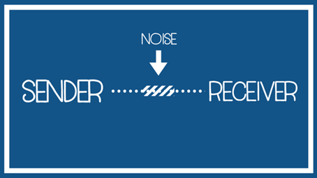
And then he explained that there are three elements involved in communicating a message: the sender, the receiver, and the message itself. When a message goes wrong, it goes wrong at one of these three places. For example:
- The sender: Atrocious handwriting, speaks a different language, has a cold and is all stuffed up.
- The receiver: Preoccupied, didn’t bother to check email, distracted by a TV show.
- Noise that disrupts the message: Lousy cell phone reception, someone talking in the background, the ridiculously noisy frappuccino machine at Starbucks that’s too loud for anyone to even hear themselves think.
When we think of communication, we usually think of sender and receiver. We forget to consider the space that carries the message. On the internet, this space is the screen itself, and the noise is a page that’s hard to read.
People Read Screens Differently, So You Must Write for Screens Differently
People don’t read material on the screen the same way they read a book or a letter. They scan it.
They check out beginning sentences to find out what the post is about and then they scroll to the end, looking for something to catch their attention along the way. If it does, they might stay for a while. If the page is too difficult to read or if nothing stands out, they move on to another site.
Your job as a writer is to slow the reader down. Each sentence you write has the job of getting the reader to the next sentence.
You’re writing because you have something important to say. It only makes sense to lessen the noise so that you get heard. It’s as simple as employing a few techniques that help your reader slow down. I expand on some of these techniques below, but you can also download a free PDF to see a step-by-step guide on implementing them.
Create a Layout That Allows for White Space
You want to make your words stand out, so don’t treat screen space like it costs as much as California real estate. Spread out. Leave wide margins. Think spacious and roomy.
Choose fonts that are easy to read. Most experts recommend a sans-serif font set to at least 11 point for the main body of the post.
If you use sidebars in your template, don’t crowd them with widgets and ads. Moderation is best.
Break Up the Text
When writing for the screen, there are several ways to avoid the dreaded wall of text. You’ve created white space around your writing. You’ll want to get some flowing through it, too.
Use Headings
Some people create headings by making the font big and bold—but you should use the heading labels in the drop-down menu at the top of your draft box. Heading labels also inform search engines about your post. The search engine bots know to look for heading codes.
After a few introductory sentences, insert an H1 that will set the direction of your post. A subtopic will get an H2, and a subtopic of that will get an H3, and so on.
Feel free to use a different font for your headings. If your heart sunk when I said that most experts recommend a sans-serif font, this is where you can be creative. Use that exciting serif font! Make it a different color so that it stands out, if you’d like. But don’t go too crazy. If you put more than two or three fonts and colors on a page, it will start to look busy.
Headings Serve a Special Role on the Screen
Headings, with their different fonts and their bolded text, serve as signposts throughout the page. They serve as a speed bump to the scanning reader.
Headings encourage the reader to slow down and read each section. They tell the reader, “This is what this bit is about. It’s not too big, you’ll love it.” And then the next heading entices, “Guess what? You’re going to want to read this next part, too!”
If you have more than 200 words in a section, bring in another heading. Give your reader a new section to read. Don’t let that wall of text come into being!
Don’t Forget Graphics and Creative Use of Text
Graphics engage your reader in a different way, keeping them interested. Use pictures, memes, and infographics to inform and make things look interesting.
Consider using text as a graphic by creating a quote that you insert between paragraphs. It will emphasize your point and break up the text.
“Consider using text as a graphic by creating a quote that you insert between paragraphs.”
Click to Tweet is another way to use text to break up your text. Click to Tweet is a plugin that will create a highlighted quote in the middle of your post, but also invites your reader to share it on Twitter and invite people to come and read.
Vary the Visual Pattern of Your Content
A few other techniques to use when writing for the screen:
- If you are listing off three or more points, use bullet points or numbered lists.
- If you want to emphasize a point in the middle of a paragraph, use italics or bold the text.
- Make your paragraphs different lengths but don’t make any of them long—four to five sentences at most.
Most Importantly, Write Well for the Screen
You can make your page look stunning, but if your writing is sub-par, people won’t read it. Put a quality product on the screen and then format it.
Writing for the Screen Is Conversational
It’s important to keep this in mind: web writing is a conversation, so it should read more like a discussion and less like an essay. Eighth-grade English teachers may not be happy, but your readers will be.
Some rules to follow that apply to just about anything:
- Keep your audience in mind and use terms they use. If a simple word will do, don’t use a more complicated one without a good reason.
- Vary your sentence length. A long chain of short sentences is choppy. One long sentence after another wears out your reader.
- Devote considerable time to writing your headline and headings. Google “how to write a good headline.” You will find plenty of tips.
Some rules that are particular to web pages and blogging:
- Talk to your reader. Use “you.”
- Don’t be afraid to start a sentence with “and,” “but,” or “so.” Transitional words feel more like talking.
- It’s also okay to use ellipses and dashes—liberally. The space they create catches your scanning reader’s eye, and they hint at the rhythm of speaking.
- Stick to one idea per paragraph and even when you are expanding out an idea, start a new paragraph. If in doubt, make a new paragraph, even a one-sentence paragraph.
A Helpful Tool for Web Writing: Yoast
What is Yoast?
Yoast is the number-one WordPress plugin because Yoast doesn’t pull any punches. It doesn’t have feelings. Yoast is that true friend who will tell you that you do indeed look fat in that dress.
If you’re using WordPress, get the Yoast plugin. Yoast walks you through basic search engine optimization, but it will also assess your post for readability, and that is incredibly helpful.
Yoast will say if you’ve started a sentence with the same word three times in a row or if you have too many words under a heading. It will aggressively tell you that too much of your post is in the passive voice. And for good measure, it will let you know where your post ranks on the Flesch Reading Ease Test.
Yoast won’t make drab writing amazing, but it will help you structure your writing for the screen.
Bringing it All Together for the Sake of Communicating
The end goal of a church website is communication. And the message couldn’t be more precious. As the message sender, making sure that your page is easy to read encourages the reader to stay and read that message.
So remember:
- Give your words lots of room to breathe. Help your reader focus.
- Good headings and graphics are signposts that keep your reader engaged.
- Vary the structure by using bullet points, lists, and quotes to keep away the wall of text that drives away your reader.
Implement these techniques on your church site and your words will have an environment where they do the work you want them to do.
Get more of Lora’s insight during our live conversation with her about writing for the screen.
Thursday, July 5 at 11:30 a.m. (CDT) on Facebook
Sources:
- Wilson, Pamela (2016) Master Content Marketing: A Simple Strategy to Cure the Blank Page Blues and Attract a Profitable Audience. BIG Brand Books.
- Weaver, Belinda (2018) Webinar: Secrets of Persuasive Online Copywriting. freelancewritersden.com