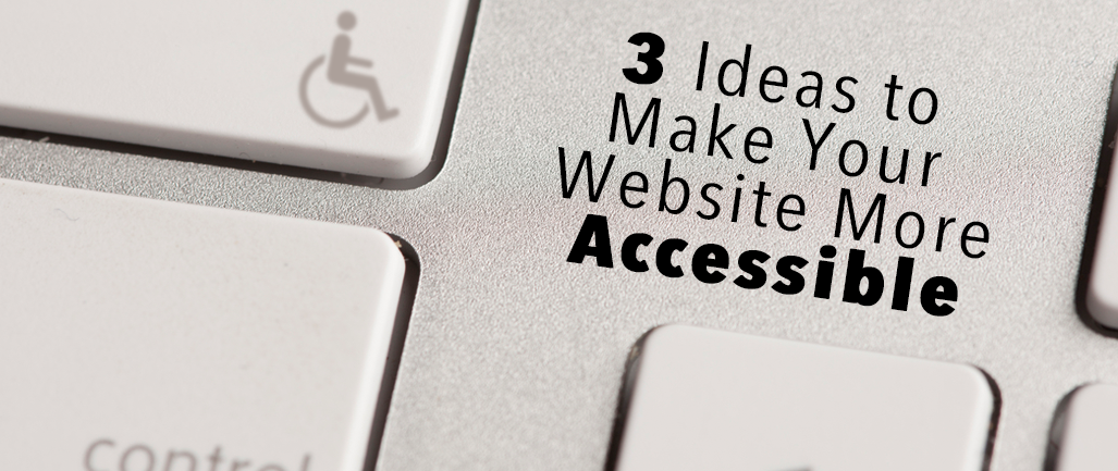
Accessibility is a relatively new concept for the ordinary person who casually works with websites. Until recently, with dynamic website builders that allow “the average Joe,” accessibility was a foreign concept for websites. Accessibility used to be reserved for items such as wheelchair ramps, automatic doors, or elevators. When used in terms of websites, however, accessibility refers to a similar function: how accessible your website is to people with disabilities or who use assistive technology.
Accessibility is a wide term, so first we must define the different forms of accessibility in order to fully understand how to change your website. Perhaps the most common example is the use of screen readers, which allow readers with visual impairments to have their computer “read” the screen to them.
Alt-text
Alt-text (alternative text) is essentially a description of an image or graphic that’s on your website. When a screen reader encounters an image, it will “read” whatever is in the alt-text, so the description should be able to fully replace the image. If an image is essential to the understanding of your webpage, include alt-text that completely describes the image.
Alt-text can be added in the HTML code using the <alt> tag within a <img src> tag, or if you use a website manager like Wordpress or Hubspot, alt-text can be assigned to a photograph easily within the system. If an image isn’t essential to the understanding of your website, then include no alt-text so the reader skips over it. Adding alt-text also improves your site’ SEO, which you can read about in our previous blog post.
Navigation
Navigation is another important aspect of accessibility. Navigation grounds your user within your website and lets them know where they’re at on your site. Navigation links should be clearly labeled, and dropdown menus should be easy to click on. You know those dropdown menus that even the most dexterous people can’t click on because your mouse has to be in a very precise location or else the menu disappears? Avoid those at all costs.
Everything on your website, including navigation links, should be able to be accessed via keyboard controls, such as arrow keys and the tab button. Some users might have disabilities that prevent them from using a mouse, so keyboard controls are a must. Test your site on different browsers, too.
Closed Captioning
Lastly, if you have any videos or podcasts on your website, make sure they are closed captioned or that you provide a transcript. Users with audial impairments or who speak a different language may require or prefer to read rather than listen to a video or audio post.
Along those same lines, make sure the copy on your website is easy to read, especially if people whose first language isn’t English will be reading your site. Some lofty theological terms may confuse people who aren’t fluent in English, so make sure the text is informative, true, but easy to understand.
Accessibility is an important part of building any website, and it doesn’t require a lot of extra work. In the end, accessibility improves users’ experience and encourages them to come back to your website—plus, it shows that you put in the extra thought to consider people whose Internet experience is different than your own.
Want to receive notifications about more content like this? Subscribe to this blog, Technology & Your Ministry.
{{cta('35e945a3-57b9-4426-b284-53c61bf91951')}}


