

They say, "Beauty is in the eye of the beholder," but whoever said that clearly has not seen some of the spreadsheets that I have seen.
In my last blog post about helpful formulas, I mentioned that I have an unhealthy obsession with Microsoft Excel. That's only part of the story; I'm also an data visualization snob.
Now, I don't spend a lot of time making charts and graphs. That can be a lot of fun (ok, my definition of "fun" may be a bit different than yours), but what I really like to do is make tables look better.
In the church office, you'll probably spend some more time looking at tables of data than reviewing charts. The information in these tables may not be what you call "data," as it could be something like a list of VBS registrants, confirmation students (with their corresponding parents, godparents, and Bible verses), or even the weekly church calendar.
This data needs to be easily read and understood at a glance, and there good and bad ways to do that.
Starting Point
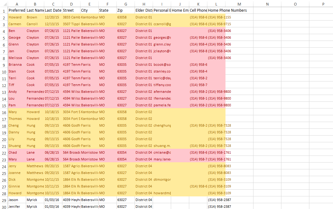
This post will use the example an Absentee Report by Elder District (a list for each elder of people in their district who have been absent from worship for an extended time period) and provide some best practices on how to communicate that data as clearly as possible.
To start, let's assume that this data was exported from your church management software. In an effort to make certain data stand out, certain rows were highlighted red or yellow depending on how long it had been since that person was at church.

You may click on each the image to see more details.
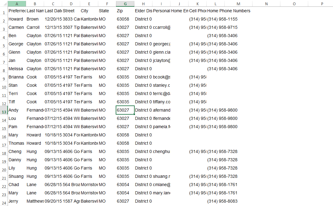
1. Clean up the Data
Before you do anything, remove any unnecessary data. Just because it is included in your export does not mean that you must include it. Consider your audience, their purpose, and what information they might actually need (or have requested).
In this case, I have deleted a number of columns, including Title, First Name (Preferred name is kept), Middle Name, Work Email, and Work Phone.
2. Remove Colors and Gridlines
Now, undo what was done with the coloring of the cells by making the background white. Then, remove the gridlines on the sheet by going to the View tab and unchecking the Gridlines box.
The goal is to focus on the data itself. Colors, whether in the background, on the font, or with the gridlines, distracts from the main purpose, which is to read the actual data.

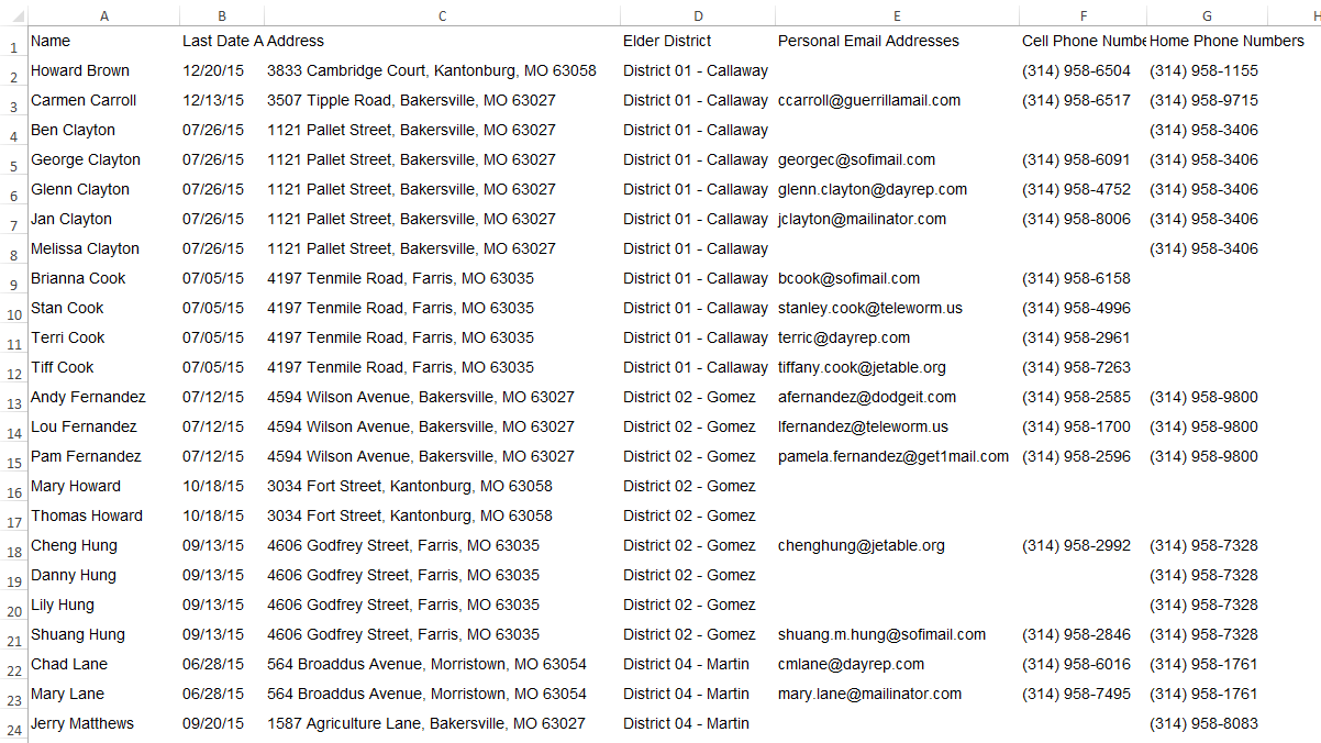
3. Optimize the Font Family, Font Size, and Row Height
There are different schools of thought on what Font Families are the most readable, and in the end, it often comes down to personal preference.
I tend to lean towards San Serif fonts (like Arial or Helvetica Neue) because they don't have the decorative features of Serif fonts, which tends to make them a bit more readable. Lately, I've been using Roboto because it is the standard for Android devices, but for this example, I'll use the more common Arial.
Font size can be a little relative. If your document is going to be read on a screen, then size doesn't really matter because the read can zoom in if needed. If the document will be printed, then size is a factor, but I tend to focus on getting the data to fit nicely on a single sheet or two, so the size is adjusted to match the print criteria.
More important than size itself is the relation of the font size compared to the row height. I tend to use a 2:1 for ratio of row height to font size.
in this example, if have switch the font to Arial size 12 and the row height on all rows to 24.
4. Combine Data (When Possible), Distribute Columns
Having distinct data fields separate from all other data can be good, but at other times it is completely unnecessary. Whenever possible, data should be combined to save space.
In this example, I have combined Preferred and Last Name to become just Name, and have combined the City, State, and Zip fields into one column.
After making sure the combinations work, distribute the column width so that all the data is visible.
5. Group and Sort Your Data
Bring the focus back on your audience. How are they going to use the data? Assuming they are going to have a printed version of the data, they will not be able to filter or sort it on their own, so you'll need to do that for them while you can.
In this example, each elder is only going to care about their own district, so that is the first set of data to sort. After locating their own district, each elder will probably begin contacting individuals based on those who have been absent the longest, so applying a secondary sort of Last Date Attended would assist them in that process.
After sorting, I make it more readable by grouping the data by Elder District, then move the Date Last Attended to be more visible by putting it first. Moving the Elder District to become a group header also eliminates a column of data, which allows for additional spacing.
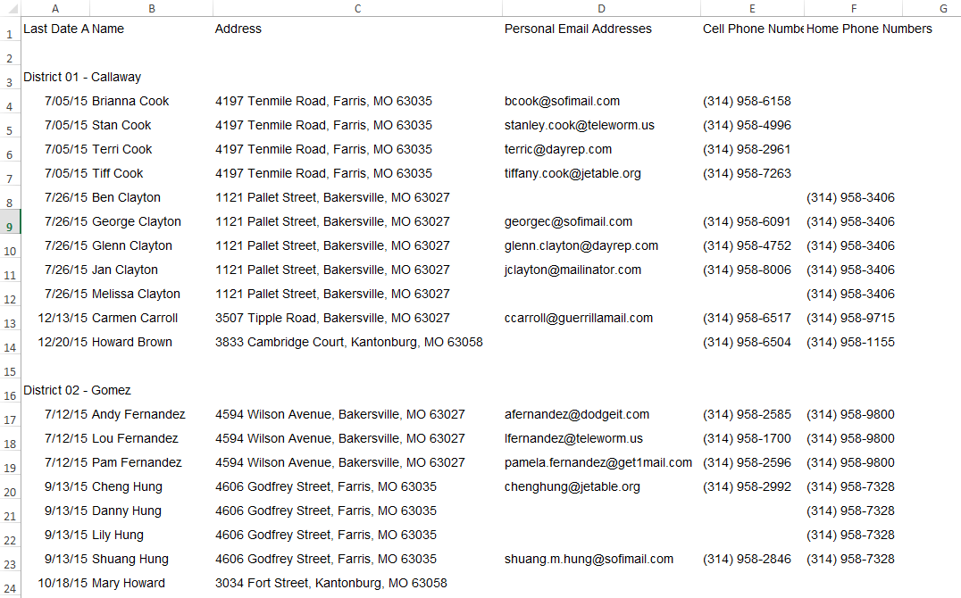
6. Add Finishing Touches
The last thing to do is to make the page a bit prettier and focus on the data even more. There are a variety of little things you can do to accomplish this.
- Add a page header that has a slightly larger font than the group headers.
- Make the group headers a little larger, but don't over emphasize them
- Move the column headers to repeat above each section, changing the font color to a light grey, the size to 10pt, and adding a short column after to give some space.
- Add horizontal lines to separate the data, but keep the color very light.
- Align certain columns to the right to draw "lines" within the data, like with the "/" in the dates or the "," in addresses.
- Add indents (where needed) to give more white space.

I can't take credit for all of the concepts listed above. While I learned some of them as I worked in Excel, the rest I learned by reading Stephen Few's books Show Me the Numbers: Designing Tables and Graphs to Enlighten and Information Dashboard Design: Displaying Data for At-a-Glance Monitoring. They're not really books you would pick up and read cover-to-cover, but they are fascinating reads and describe a lot about how people learn and understand information.
Learn more about how to leverage technology in the church by reading
our free ebook "Technology & Your Ministry."
{{cta('eae694c9-6c27-4cc9-be28-3d2ba3e47eb2')}}


