We’ve refreshed Church360° Ledger by updating the navigation icons, optimizing page layouts, and making other improvements to the design throughout the software.
Updated Navigation Icons
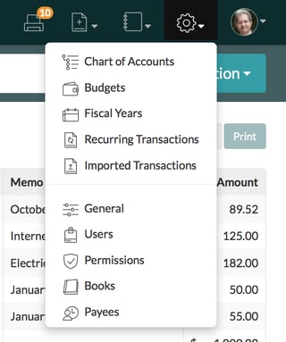
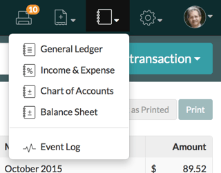
The icons in the top navigation and drop down menus have been updated to better identify the pages within Church360° Ledger:
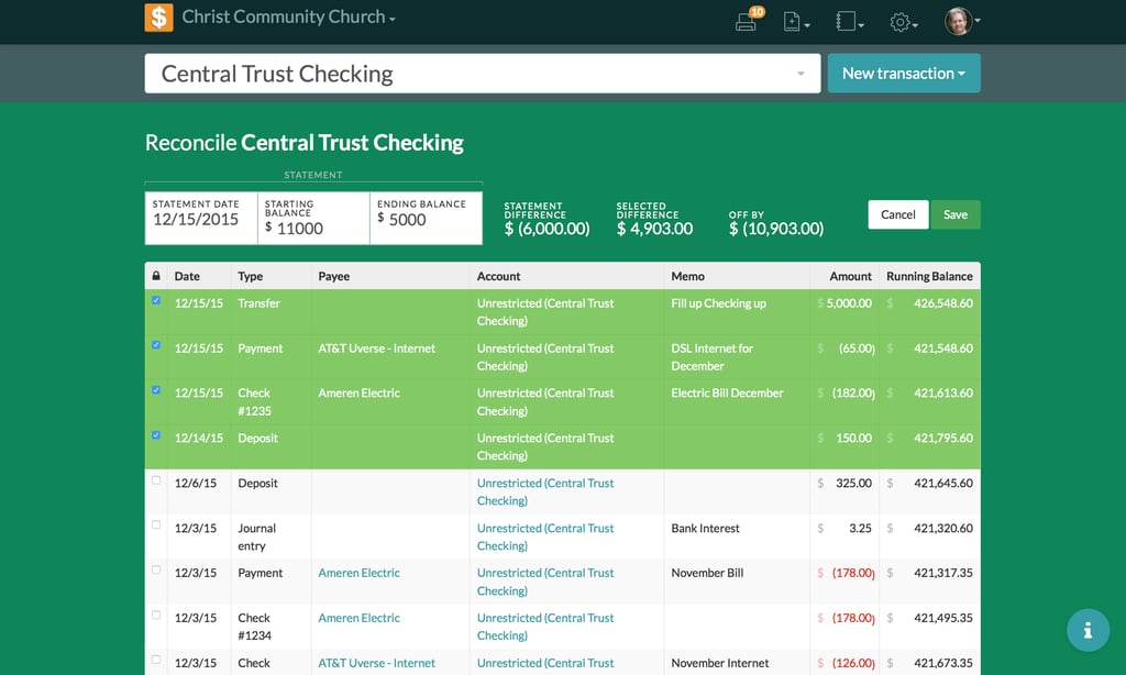
New Reconcilliation Mode
We’ve created a new, immersive experience when Reconciling accounts:
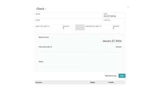
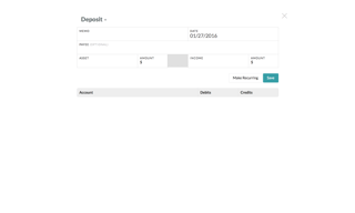
Full-Screen Transactions
Now when you enter a new transaction, Church360° Ledger enters a full-screen view:
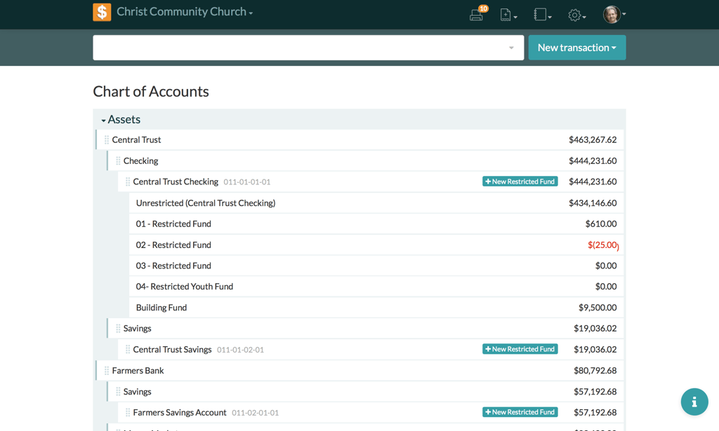
Improved Layout on Settings Pages
In the various pages under Settings, such as Chart of Accounts, Budgets, and so on, we removed the side navigation to improve the page layouts (to navigate to the different Settings pages, you can continue to use the drop down menu under the Settings icon in the top navigation):
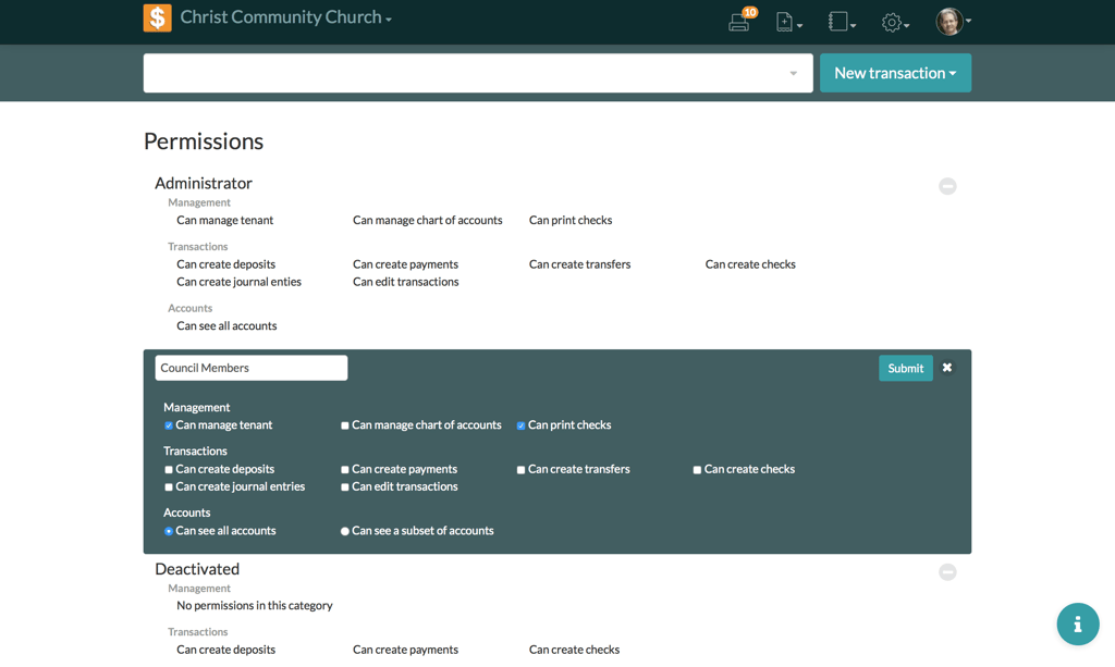
Unified Design Elements
Many subtle details were updated to better unify Church360° Ledger’s design with Church360° Members and Church360° Unite. Adjustments to colors, button design, and more improved the appearance and function of aspects fo the software, such as Permissions:
If you would like to receive automatic updates about Church360° Ledger, please subscribe to our product blog. You can choose to receive updates on an instant, weekly, or monthly basis.


